
(BECAUSE SOMEONE HAS GIVEN ME A JOB RIGHT?!).
So I wrote this very long essay about Kingsley Amis for my MA, and one of the the byproducts of it was that I ended up doing a sort of impromptu study of the covers of Amis's novels. I got all the criticism up from the stack of the British Library but I'd buy random editions of the novels from second hand shops for £2 each so I could dog-ear the pages and come back and note them later. Most secondhand and charity bookshops have a whole Amis section, with Martin featuring as much, if not more than, his father. Make of that what you will.
Book covers are very like what we do. Whenever we make an advert we are asking the consumer to ignore the old axiom and judge a book by its cover. In fact an ad bears even less relation to a product than a book does to its cover because it doesn't even have the benefit of physical proximity to the object it describes. An ad makes up for it though, because it can contain pictures of what it's describing, where as a cover although attached to the book actually describes something much less concrete - the contents of the book, rather than the object of which it is also a part.
(I START NEXT MONDAY!!).
KA had a very long writing career, spanning around four decades, and his reputation evolved as he went on, from Angry Young Man, to sexy young author, to establishment figure, to reactionary outsider. But, for complex reasons (which, if you're interested, I can send you a 15,000 word essay about), Amis's subject matter changed very little. So what we have is a fairly consistent product that is differently perceived by each successive era.
Something like a very well known brand that has a series of different agencies work on it.
Obviously there are a few obvious reactions to the brief. Since they're largely concerned with the relationships between men and women, really, almost all Amis covers could be like this:

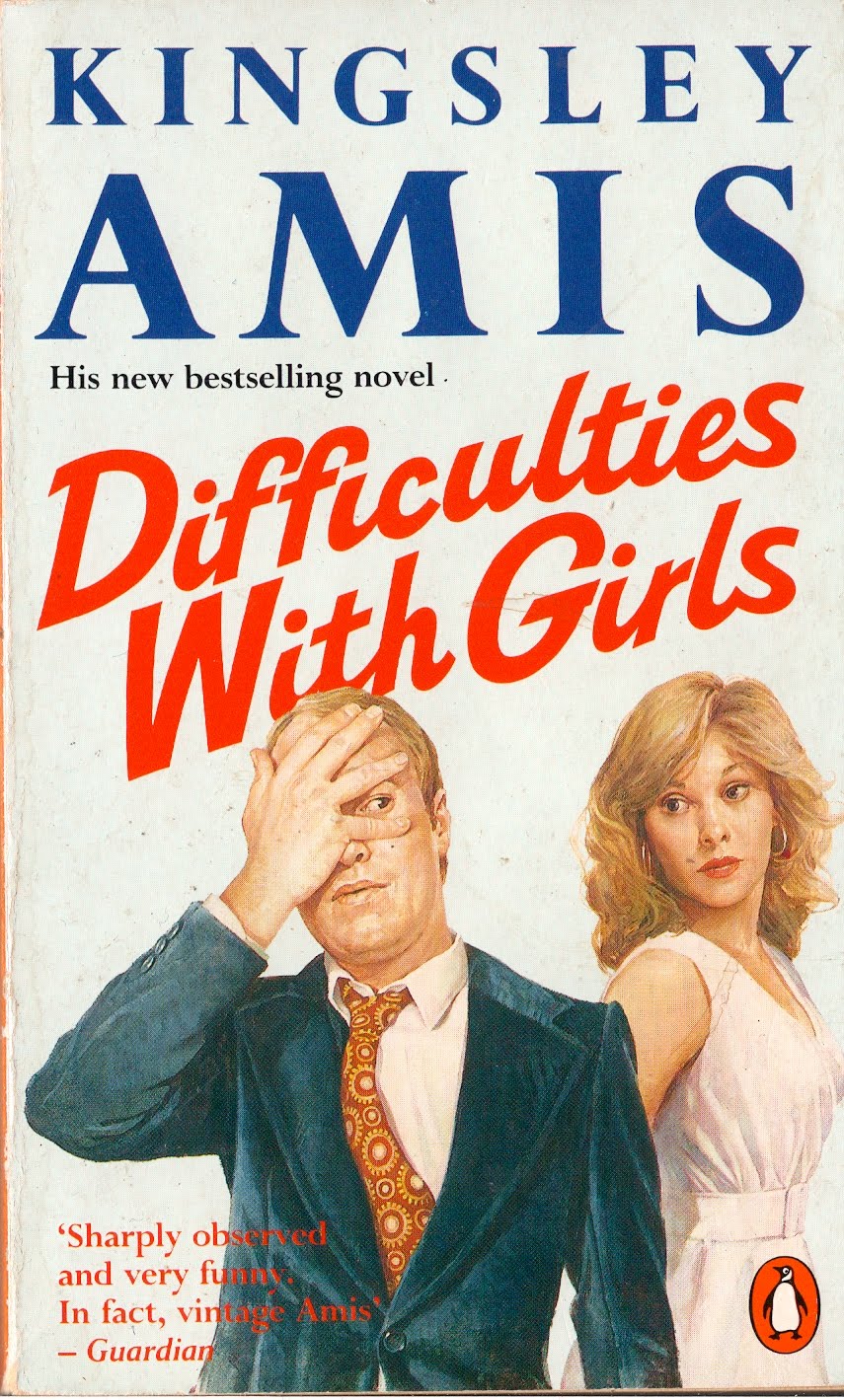
Personally I don't like these covers much because I don't want to be told what Patrick Standish or Jenny Bunn look like - I think that's something I do on my own with Kingsley Amis, and I don't appreciate having to share that experience with a illustrator who's probably only skim-read the novel. Both of these are rather craven portrayals of the character, Stanley with a little moustache, Patrick blonde and balding at the temples. They don't tell me what's interesting about these books, what makes them different, in fact all they tell me is what's inside the book, which is redundant, given that it's inside the book. The Difficulties cover is a 1989 number, the Stanley cover is the Vintage 2008 reissue. Difficulties is set in the 60s and Stanley in the 80s, but you wouldn't know it would you? The primary fidelity of these covers is to the aesthetic sensibilities of the time in which they were produced.

This cover on the left is just straightforwardly misleading. This edition is from, who would have thought it, 1970. Amis writes about sex but never describes it, never really describes bodies, male or female, but does occasionally mention breasts. There is sex in this book, but perhaps not as much or of the kind that you might hope for had you only seen the cover. The problem is that the cover art is based on a perception of what the audience wants - the art director lost track of the truth of the novel in the pursuit of his audience.
(BETTER MAKE SURE I DON'T DO THAT...IN MY NEW JOB!!!!)
(BETTER MAKE SURE I DON'T DO THAT...IN MY NEW JOB!!!!)
The best covers are not those that try to represent the characters, but those that represent the themes:


The Old Devils and Jake's Thing are concerned with the end of a life spent drinking and an Oxford don's struggle with impotence respectively. Both of these are visual gags of a very high order indeed - not only is that good in itself, but their comedy, in turn, describes the humour and intelligence of the books. By hanging on to the essence of the books they avoid the pitfalls of pandering to the audience. They also avoid merely repeating information that is already in the books (by showing characters and situations etc.) and instead offer something that's more like a new interpretation of the same central idea. This, I believe, is what bastards mean by 'adding value'.
But obviously this too can go too far, the cover that really makes me laugh is the new Penguin 50s 2010 edition of Lucky Jim. Imagine being the client on this one:

'Yeah so hi Peter Blake, love the cover and everything, but is there any chance we could have the title just a bit bigger? Because at the moment it looks like the title of this million selling book that everyone knows the name of, and is on reading lists all over the world, is England's Glory - which, yes, would be a great title for a book obviously - but isn't actually ... yes I have heard of the Sergeant Pepper's album ...'
I reckon the good ones will age best. I wrote a thing for the Tattooed Lady Magazine recently about the History of Advertising Trust and how adverts are totally contemporary and therefore totally disposable - but isn't it almost always true that the best ones aren't? And therefore doesn't it follow that the that best ones are tied to the truth rather than to the time.
I've got another post about book covers - but I think I'll save it...
(BRING ON MONDAY, I'M A TIGER, A TIGER, RRRRRRRRRAAAAAAAAAAARRRRRRRGH!)
5 comments:
How's the job going? And what is it.
I can never get more than ten pages into Lucky Jim.
This obviously means that Amis is an overrated hack.
Job is going well so far. It's a copywriting job.
It's interesting (a bit) how books are repackaged and redesigned regularly so as to seem contemporary and appealing to a new audience. But that has very rarely been the case with music. Album covers are seen as cultural totems fixed in time. You can't imagine, say, Pet Sounds or Unknown Pleasures or Songs for Swinging Lovers being tarted up to appeal to today's kids. The album cover is as much part of the artefact as the music itself. But the book cover is not. And indeed books have different covers have different covers simultaneously in different countries. Why is that, I wonder?
Very interesting point Neil, and I'm not just saying that because I now work for you.
Is it just because authors, with a few exceptions, tend not to be terribly image-aware and are happy to wander around with yoghurt on their cardigans?
The minority that are seem to thrive wonderfully.
Post a Comment